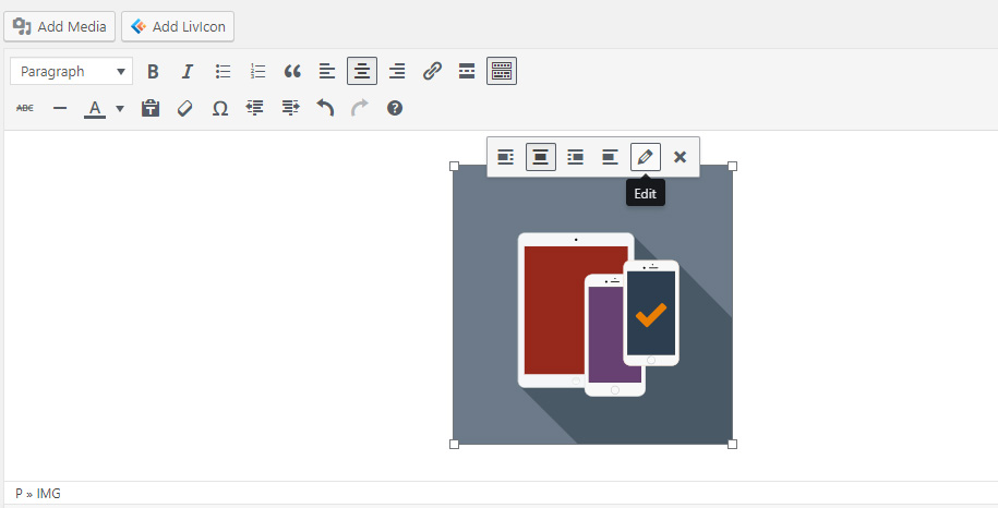
1) Via the Classic editor in posts/pages
- Upload your ready to use SVG file(s) via Media Library.
- Insert your uploaded file(s) into your post (page) as any other image.
- Click a pencil icon to edit this image.
- Add class
enlivenem into the Image CSS Class field and click Update
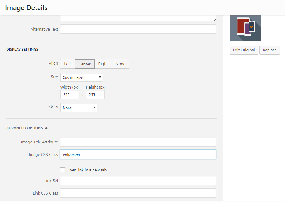
Please keep in mind that Size setting from the screen above will NOT take effect! Both width and height attributes must be set within <svg> tag itself in your SVG file.
2) Via the Gutenberg block editor in posts/pages
- Go to the General Settings page of Enliven 'em plugin.
- Add a custom CSS selector for a container where your animated SVGs will be placed, say
enlivenem-container
In that case your CSS selector should be .enlivenem-container img:
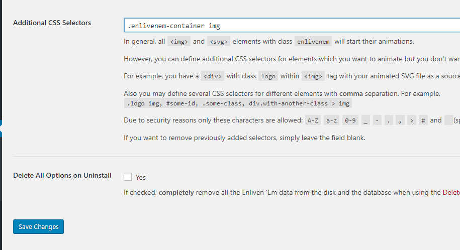
You should do such setting only once.
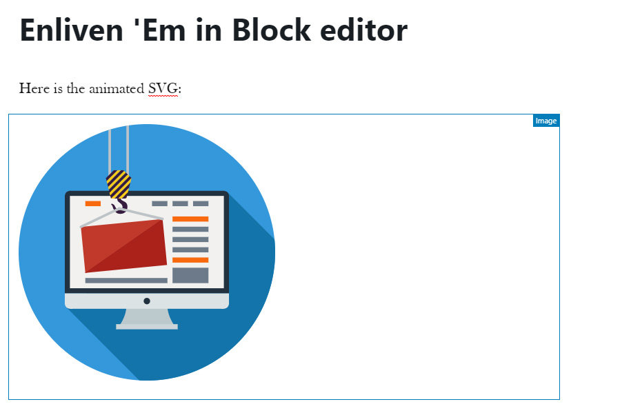
- Upload your ready to use SVG file(s) via Media Library.
- Insert your uploaded SVG into your post (page) as image block:
- Add class
enlivenem-container into the Additional CSS Class field at the right Image block settings panel:
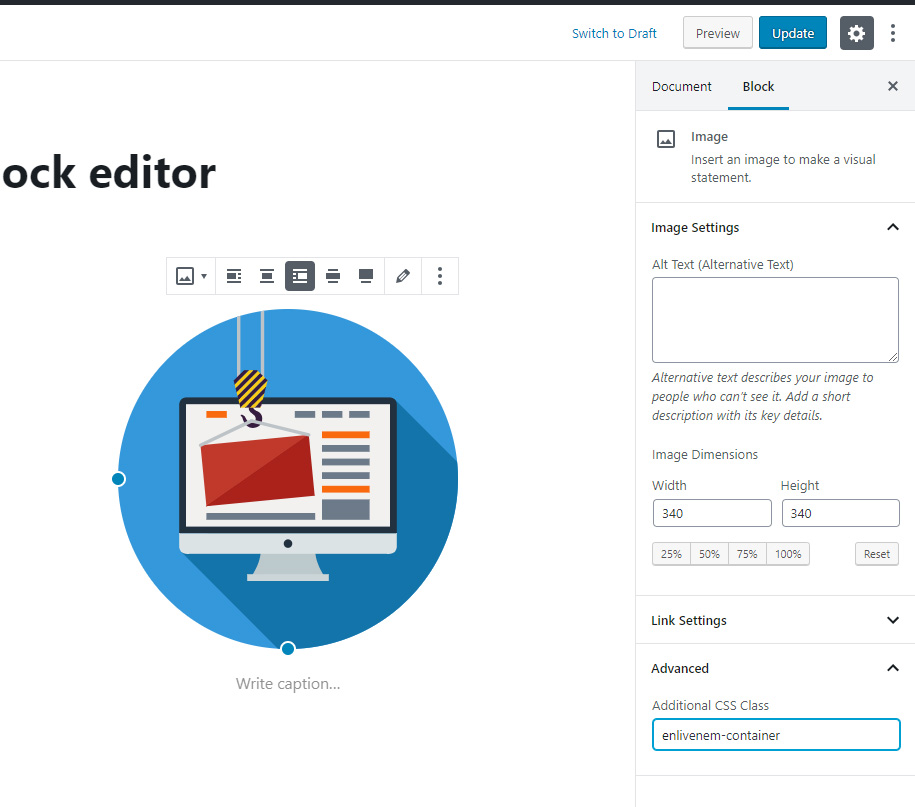
Important! Please do not use any alignments for the image if you have set responsive option inside data-global-elvn attribute of your SVG (see the details below in the "Make SVG enlivened" section).
3) With Elementor (https://elementor.com) plugin
- Go to the General Settings page of Enliven 'em plugin.
- Add a custom CSS selector for a container where your animated SVGs will be placed, say
enlivenem-container
In that case your CSS selector should be .enlivenem-container img:
You should do such setting only once.
- Upload your ready to use SVG file(s) via Media Library.
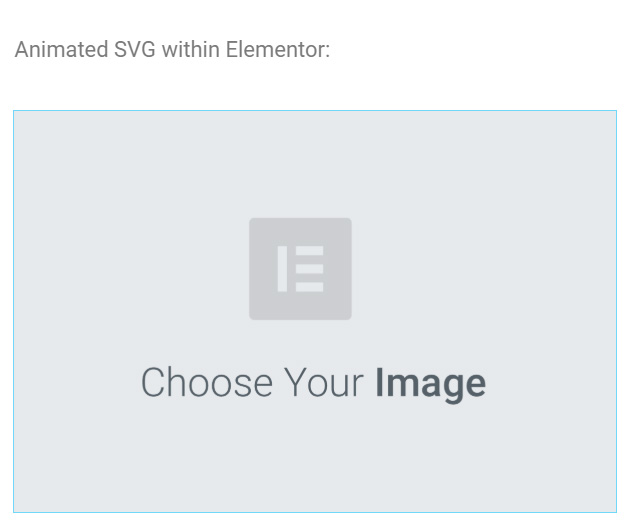
- Add your animated SVG via Image widget as any other regular images like png, jpg, etc.:
- Click the Advanced tab of the Edit Image widget:
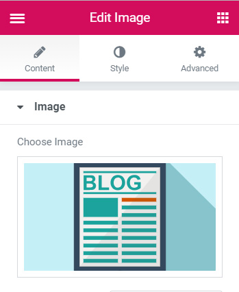
- Add class
enlivenem-container into the CSS Classes field at the left sidebar:
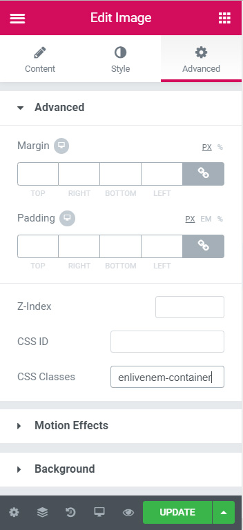
- Click Update button
4) with WPBakery Page Builder (formally known as Visual Composer) plugin
- Upload your ready to use SVG file(s) via Media Library.
- The best way for Enliven 'Em images inside WPBakery Page Builder is to use them via standard text block:
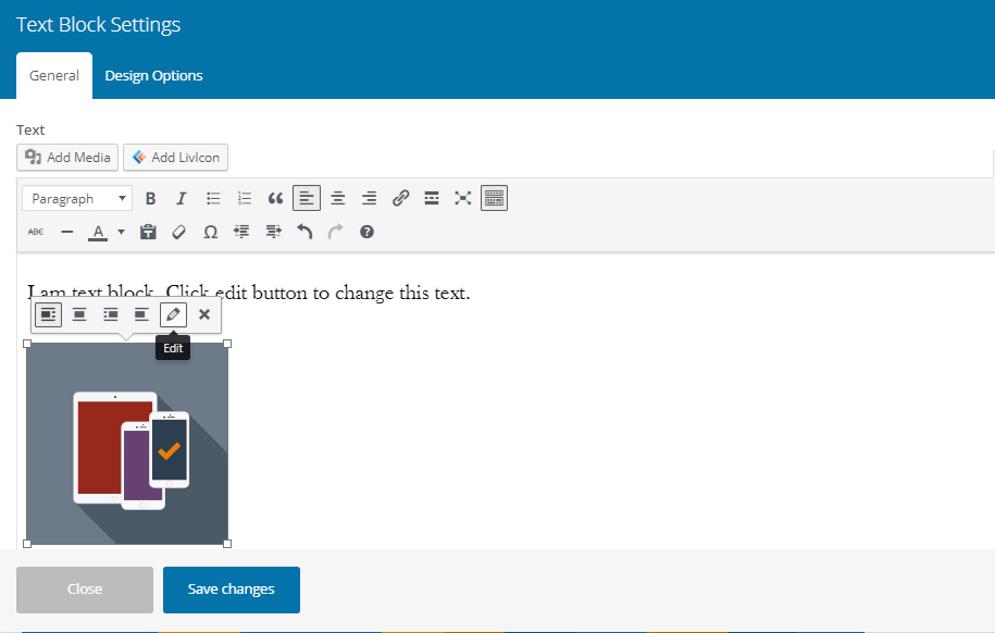
Click a pencil icon to edit this image.
- Add class
enlivenem into the Image CSS Class field and click Update
- After that click Save changes button of WPBakery text block and update your post/page.
5) With Revolution Slider plugin
IMPORTANT: The plugin doesn't have and will not have a purpose to work inside any sliders. So, Enliven 'em plugin doesn't compatible with Revolution Slider and there is no guaranties that it will work inside the slider. Furthermore, Enliven 'em animations may work in the very first slide only! It will not work in second, third, etc. slides.
- Go to the General Settings page of Enliven 'em plugin.
- Add a custom CSS selector for a container where your animated SVGs will be placed, say
enlivenem-container
In that case your CSS selector should be .enlivenem-container img:
You should do such setting only once.
- Upload your ready to use SVG file(s) via Media Library.
If you set notResponsive global option for your SVG
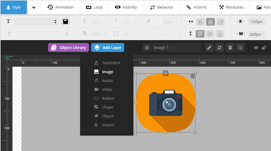
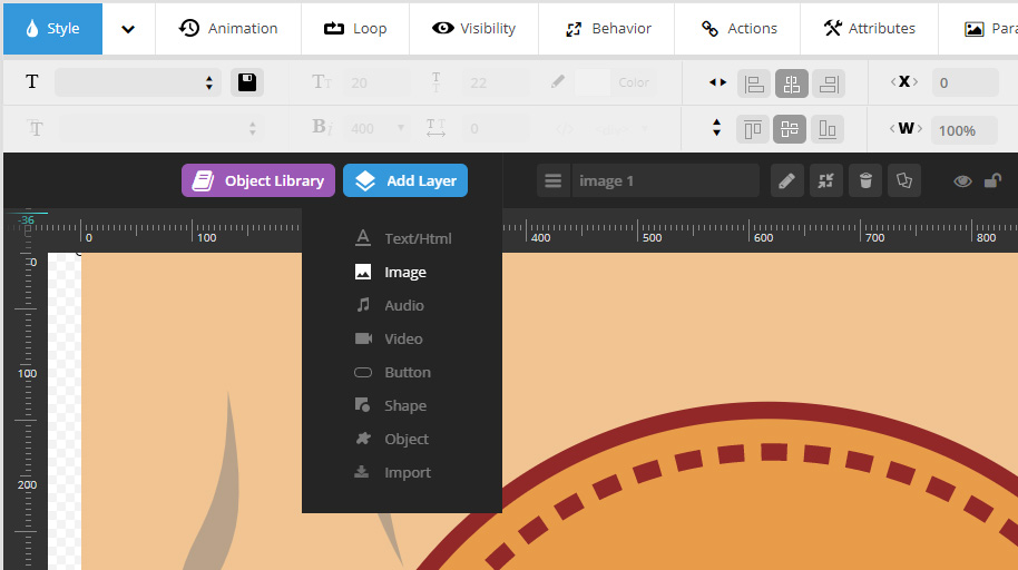
- Add your animated SVG via Add Layer > Image:
- Select just added image and click Attributes tab
- Add class
enlivenem-container into the Classes field:
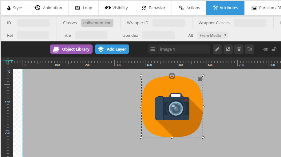
- Click Save slide button
If you set responsive global option for your SVG
- Add your animated SVG via Add Layer > Image:
- On Style tab set cover mode Full Width:
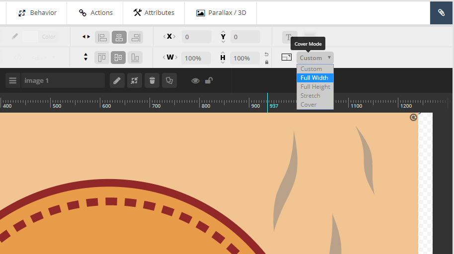
- Click Save slide button
- Select SVG image and click Attributes tab
- Add class
enlivenem-container into the Classes field:
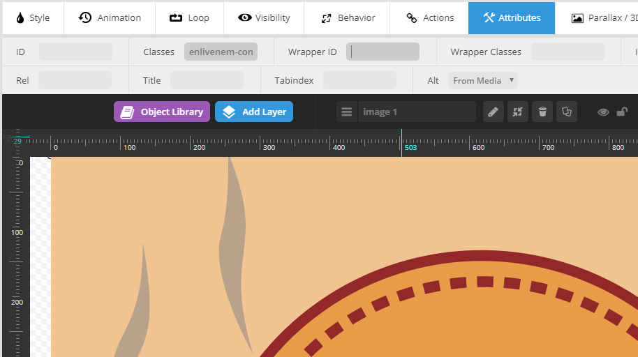
- Click Save slide button
IMPORTANT: There is no way Enliven 'em plugin works correctly inside Revo slider if cover mode is set to values other then Full Width for responsive animated SVG. Please pay attention on this feature while creating your SVG in a part of its width.
NOTE: As it was said above: "Formally, Enliven 'em plugin doesn't compatible with Revolution Slider". So the support does not cover any issues with this part of functionality.
6) Via wrapper shortcode
You can use your animated SVG via special shortcode:
[enlivenem_wrapper source="http://your_site.com/path/to/your-animated-image.svg"]
As a result you will get this code is being inserted in your page (post) HTML:
<div>
  <img class="enlivenem" src="http://your_site.com/path/to/your-animated-image.svg">
</div>
Also the shortcode can take two options: class and style, if needed. The class one can hold additional class name for wrapper div and the style one can contains additional styles for that wrapper.
[enlivenem_wrapper class="some_custom_class" style="width:42%;" source="http://your_site.com/path/to/your-animated-image.svg"]
As a result you will get this code is being inserted in your page (post) HTML:
<div class="some_custom_class" style="width:42%;">
  <img class="enlivenem" src="http://your_site.com/path/to/your-animated-image.svg">
</div>
7) Via pure HTML code
Of course you can use a pure HTML code in any page, post, widget, etc without using the shortcode or any WYSIWYG options. Please do not forget to add enlivenem class to your img tag:
<img class="enlivenem" src="http://your_site.com/path/to/your-animated-image.svg">
8) Via pure SVG code
As you know, SVG code is XML markup language. So you can simply use it on your site as a part of your HTML (PHP) directly instead of using the img tag. The other benefit of this mode is that it reduces a page's loading time, and HTTP requests.
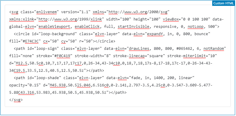
Especially it's easy to add direct SVG code inside Custom HTML block of Gutenberg editor. Here is the code of a small animated icon. Please do not forget to add enlivenem class to your svg tag:
<svg class="enlivenem" version="1.1" xmlns="http://www.w3.org/2000/svg" xmlns:xlink="http://www.w3.org/1999/xlink" width="100" height="100" viewBox="0 0 100 100" data-global-elvn="enableViewport, enableClick, full, startInvisible, responsive, 0, notLoop, 500">
  <circle class="elvn-layer" data-elvn="expandY, in, 0, 800, bounce" fill="#E74C3C" cx="50" cy="50" r="50"></circle>
  <path class="elvn-layer" data-elvn="drawLines, 800, 800, #065462, 6, notRandom" fill="none" stroke="#F0C419" stroke-width="8" stroke-linecap="square" stroke-miterlimit="10" d="M12.5,50.5c0,10,7,17,17,17c17,0,26-34,43-34c10,0,18,7,18,17s-8,17-18,17c-17,0-26-34-43-34C19.5,33.5,12.5,40.5,12.5,50.5z"></path>
  <path class="elvn-layer" data-elvn="fade, in, 1400, 200, linear" opacity="0.15" d="M45.938,50.5l5.046,6.516c0,0-2.141,2.797-3.5,4.25c0,0-3.547-3.609-5.477-5.88C43.316,53.983,45.938,50.5,45.938,50.5z"></path>
</svg>
Here is how it looks in the Gutenberg editor:
9) Use for theme's images
If you can't add class enlivenem and use a shortcode (for example in PHP theme files) simply define Additional CSS selectors on a General settings page of this plugin:
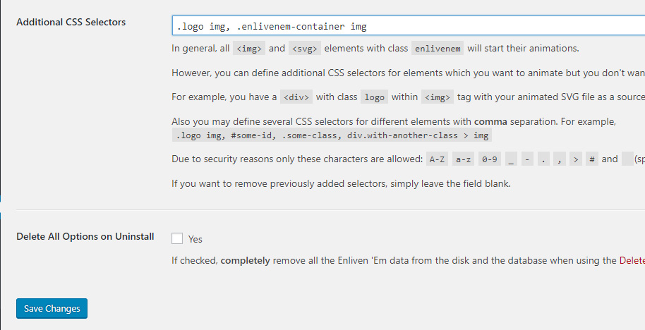
You can find out what selectors to use by inspecting elements in developer mode in your browser (F12 key in Google Chrome or FireFox).
In the example above, a hypothetical theme contains a div with class logo which contains img tag with animated company's logotype. So in that case, the additional CSS selector should be .logo img
10) Advanced usage via JavaScript (for Developers)
You can use any CSS selectors for your <img> tags to start Enliven' em script programmatic.
In that case use the custom jQuery method: jQuery( 'your_css_selector' ).enlivenEm( callback );
The callback function (if passed) will be invoked when all SVG data is ready to start the animation.
Also, if you want to invoke click event programmatic on your animated SVG, you can use special method jQuery( 'your_css_selector' ).svgClick(); because the standard jQuery .trigger('click') one doesn't work with SVG.
11) Bonus
The script will convert any SVG image from <img> tag with class enlivenem to its in-line form automatically.
So if you even don't use any animation, you can convert your SVG into in-line (SVG code will be embedded to a page's one) form and control CSS styles of that SVG shapes (path, circles, polygons, etc.) via external style sheets.